Role
UI UX Designer
Timeline
2024
Tools
Adobe PhotoshopAdobe IllustratorFigma
Skills
Wireframing & PrototypingUser Journey MappingEnterprise DesignWeb DesignResponsive Design
Redesigning a global imaging leader's corporate site, adhering to strict brand standards and coordinating with international teams.
The Challenge
Join an ongoing corporate website redesign project for Canon and execute the UX/UI implementation while strictly following established brand guidelines. The challenge was optimizing user experience within the constraints of corporate approval processes and maintaining Canon's premium brand identity.
The Outcome
The redesigned website was successfully implemented and published on Canon's official domain, providing an improved user experience while maintaining the excellence and professionalism associated with the Canon brand.
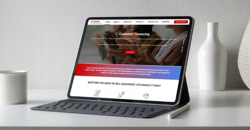
“Due to strict NDA policies, final UI visuals are omitted. However, this written case study outlines the complete design process and strategic impact. Detailed insights can be shared during a private conversation.”
Challenge Understanding
I joined this project mid-stream: the initial user research and persona work had already been completed by the lead designer. My role was to take those established findings and Canon's strict brand guidelines and execute the complete website redesign in Figma.
The team on the Anexinet side included a Project Manager, a Business Analyst, and two to three developers. On Canon's side, their marketing and design team provided strategic direction through regular Zoom sessions. They set the standards; I translated them into a functional, improved user experience.
Canon's brand guidelines were non-negotiable: every color, typeface, and visual element had precise specifications. The real challenge wasn't creative freedom; it was finding meaningful UX improvements within a very rigid corporate framework, while navigating an approval process that filtered through multiple levels of Canon's international hierarchy.
Design Approach
My first step was to thoroughly study Canon's brand ecosystem: their existing digital presence, institutional photography standards, and the specific guidelines document I received from the previous designer. I needed to internalize these rules before proposing any changes.
Collaboration with Canon's marketing team happened through regular Zoom calls across different time zones. I learned quickly that framing UX decisions in terms of brand consistency and business objectives was more effective than presenting them as usability improvements alone. Speaking their language built trust and sped up approvals.
The redesign work happened entirely in Figma. I reorganized the information architecture, simplified user journeys, and restructured content hierarchy, all while ensuring every visual element matched Canon's institutional style. The constraint-based approach actually pushed me to focus harder on what I could improve: navigation, content flow, and responsive behavior.
Implementation & Integration
Canon provided high-quality institutional photography and specific brand assets that needed careful integration. My job was not just placing them correctly, but organizing them in ways that supported clearer user flows and stronger content hierarchy.
I developed responsive layouts that adapted Canon's corporate messaging and photography across all screen sizes without compromising visual impact. The website had to feel premium on desktop and equally functional on mobile, with no exceptions for a brand of this caliber.
Every element went through Canon's validation process. I coordinated closely with the development team to ensure what I designed in Figma could be implemented accurately. The BA helped bridge communication between design decisions and technical constraints, which kept the project moving without rework.
Results & Learnings
The redesigned website was approved across all stakeholder levels and published on Canon's official domain. The final product maintained Canon's brand excellence while delivering a noticeably improved user experience: better navigation, clearer content structure, and consistent responsive behavior.
This project reinforced a key lesson: corporate UX at this level is about precision and discipline, not creative spectacle. When the visual framework is fixed, your impact comes from information architecture, interaction design, and how well you communicate decisions to stakeholders who think in business terms, not design terms.
Working with Canon's international teams also taught me how to navigate cross-cultural collaboration and multi-level corporate approvals, skills that became fundamental in my subsequent enterprise projects.
Tags
#webdesign#UI/UXdesign#redesign#corporate#corporate-website
Next Case Study